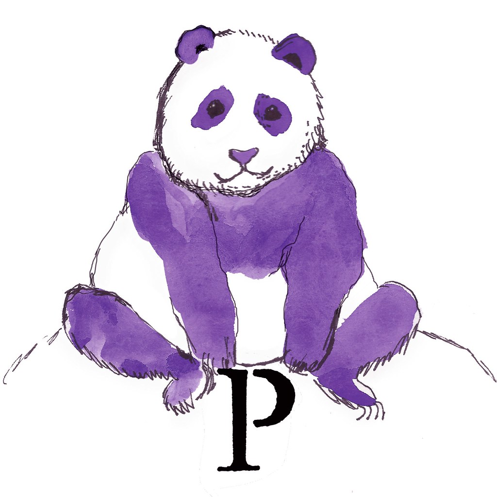
Okay I would really like your input. First of all, what do you think of my panda? Should I try to eliminate some of the black ink? Or is it just right? (Note: the weird rough circle around the P showed up as part of a file conversion. Yarg. The final version doesn't have that.)

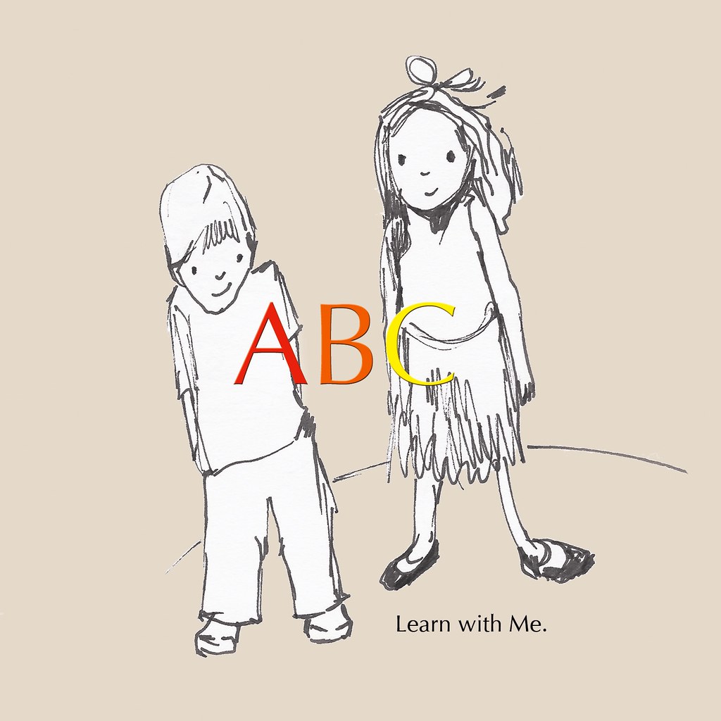
And next... I've been working like crazy to come up with a design for the back of the card. Here is a little sketch I came up with not too long ago that I think is going to work out. The drawing is just that though... a sketch. What do you think? Will it do the trick?

I had been wanting to come up with Lady Lark but I just can't seem to capture her yet. I've got a lot of drawings that look like mother hens wearing clouche hats and eyeglasses... but I have not yet finished one and thought: "There she is." And so, I continue.
 And next... I've been working like crazy to come up with a design for the back of the card. Here is a little sketch I came up with not too long ago that I think is going to work out. The drawing is just that though... a sketch. What do you think? Will it do the trick?
 I had been wanting to come up with Lady Lark but I just can't seem to capture her yet. I've got a lot of drawings that look like mother hens wearing clouche hats and eyeglasses... but I have not yet finished one and thought: "There she is." And so, I continue.

First off the panda looks great. I think that the black ink gives a good contrast and frames the whole piece.
ReplyDeleteSecond, the back of the card looks fun and quirky, I hope quirky is good for you.
Third, we just finished moving into anchorage, and we need to have you guys over for dinner.
First, thanks! Next, quirky is definitely good for me. And third (must complete trifecta) I cannot wait!
ReplyDeleteI love the Panda. He looks really huggable. The back is really cute too. I love the way they really look like your little ones but with your awesome drawing style, just like all the animals :-)
ReplyDelete